wtf?
What the hell went wrong with the British cover for the next Harry Potter book?
The American cover is better, but I’m kind of tempted to order myself a British adult edition — that whole line has nice, elegant art.

What the hell went wrong with the British cover for the next Harry Potter book?
The American cover is better, but I’m kind of tempted to order myself a British adult edition — that whole line has nice, elegant art.
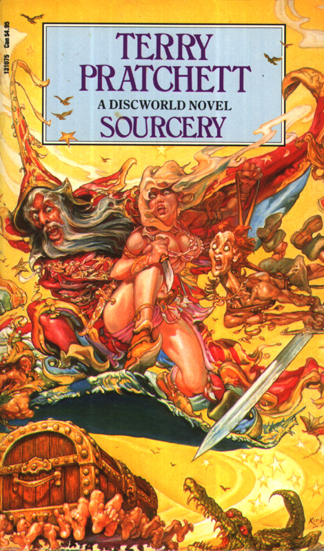
It looks a bit like the Josh Kirby covers for Terry Pratchett books. Not exactly, but I thought of Kirby when I saw that.
That was precisely what I thought of when I saw it, e.g. http://www.lspace.org/ftp/images/bookcovers/uk/sourcery-1.jpg
(There’s Hermione, Ron, Harry…)
I thought of that too, and I never much liked them.
It reminded me of Phil Foglio’s art, which I’ve always rather liked, but doesn’t really belong on a Harry Potter cover. 🙂
Foglio’s a bit less spastic, which is my problem with the Kirby covers, and this one.
giggle. It looks like Harry Potter Goes to Vegas in that first one.
Like a slot machine just paid out.
The concept of an “adult edition” of Harry Potter always kind of amused me. I mean, it doesn’t have colorful, childish art on the cover, but it still says HARRY POTTER in huge letters there. You’re not fooling anyone.
But I don’t personally like the ‘adult edition’ covers, anyway. They look very bland to me, and the Deathly Hallows one makes me think of a romance novel.
Yes, but if it were a romance novel, you’d turn to see the extra cover, which is a very manly Harry embracing a fainting begowned Cho or some such. 😀
Did I say fainting?
I meant “swooning”. 😉
<g> My understanding is that step-back covers have gone out of style again — though they were an interesting attempt to have one’s clinch cover and not have it, too.
I actually *just* bought a book that has a step back cover…it’s rather impressive. 😀
No, you’re not fooling anyone, but the British children’s editions are often so gaudy I can see the appeal of a different cover.
Someone mentioned to me that the British cover makes it look like the kids are coming out of the Stargate, which makes me laugh, because it’s so true!
I’m pretty happy with the American cover (though I couldn’t see his scar, and I thought it should’ve been there, unless that’s a major plot point or something), but the British adult version is awesome. But I think all the British adult covers of the HP books are awesome. 🙂
I’m not sure, but I think the scar might still be there; it’s hard to tell on the enlarged version.
I honestly can’t say I really like any of the covers. My initial reaction to the American cover when I saw it last month was, “that’s it?” The British adult cover elicits the same reaction from me…at least the children’s cover has an acknowledgment of other characters, that sort of thing…but it’s far too gaudy…
Yeah, the American one is unremarkable — but I’ll take that over the slot-machine color-palette explosion of its British counterpart. (C’mon, folks, look at the tone the books have been taking over the last few. Unless Rowling decided to go the Happy Fun Time route for the end of the series, I can’t imagine that cover is appropriate to the story.) The adult one matches the rest of its line, at least, with a single iconic object — and besides, I think the locket’s pretty. ^_^
Based on earlier comments on the cover, I think the plot of the last one is that Harry Ron and Hermione all join the Stargate program and take it to Vegas-world, so the ending might be a little off.
